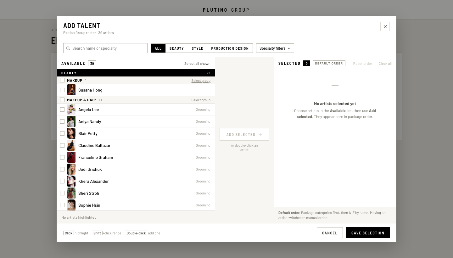
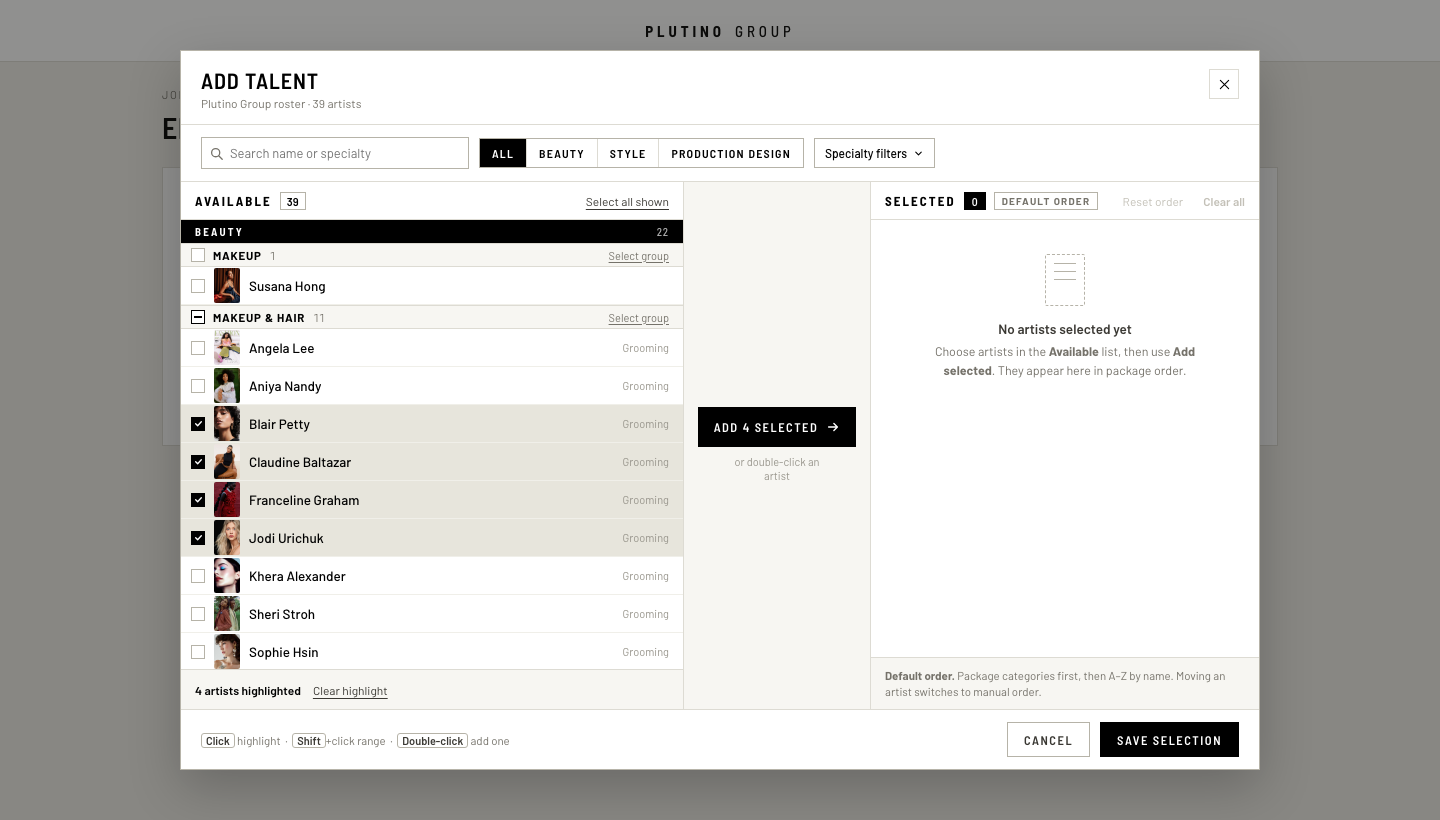
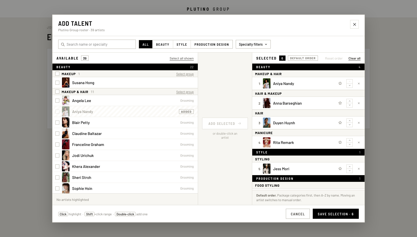
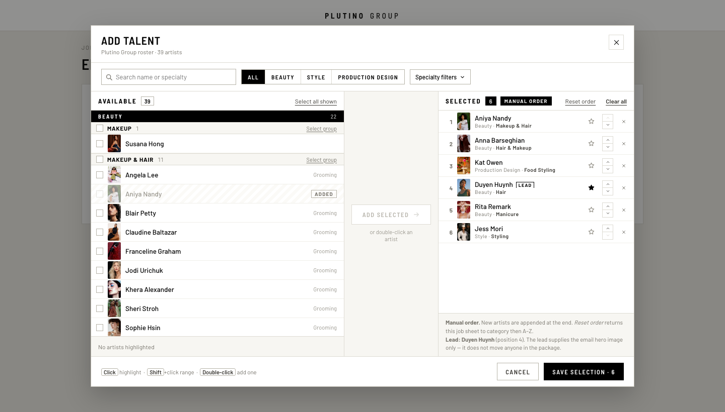
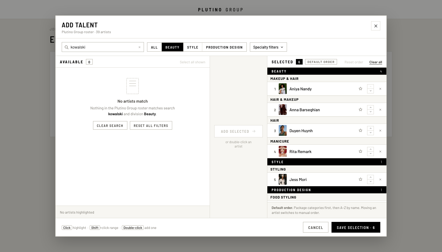
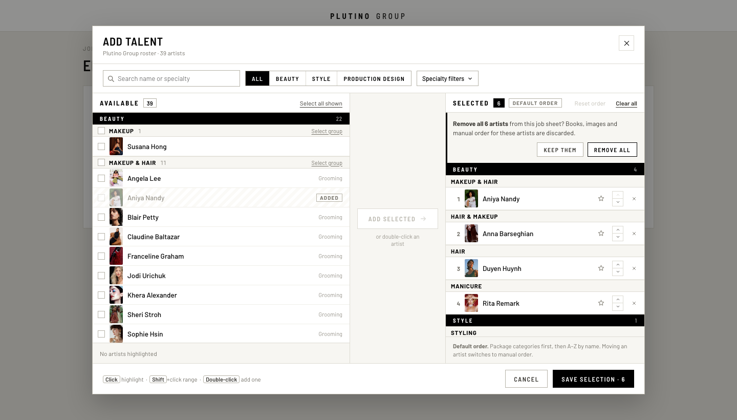
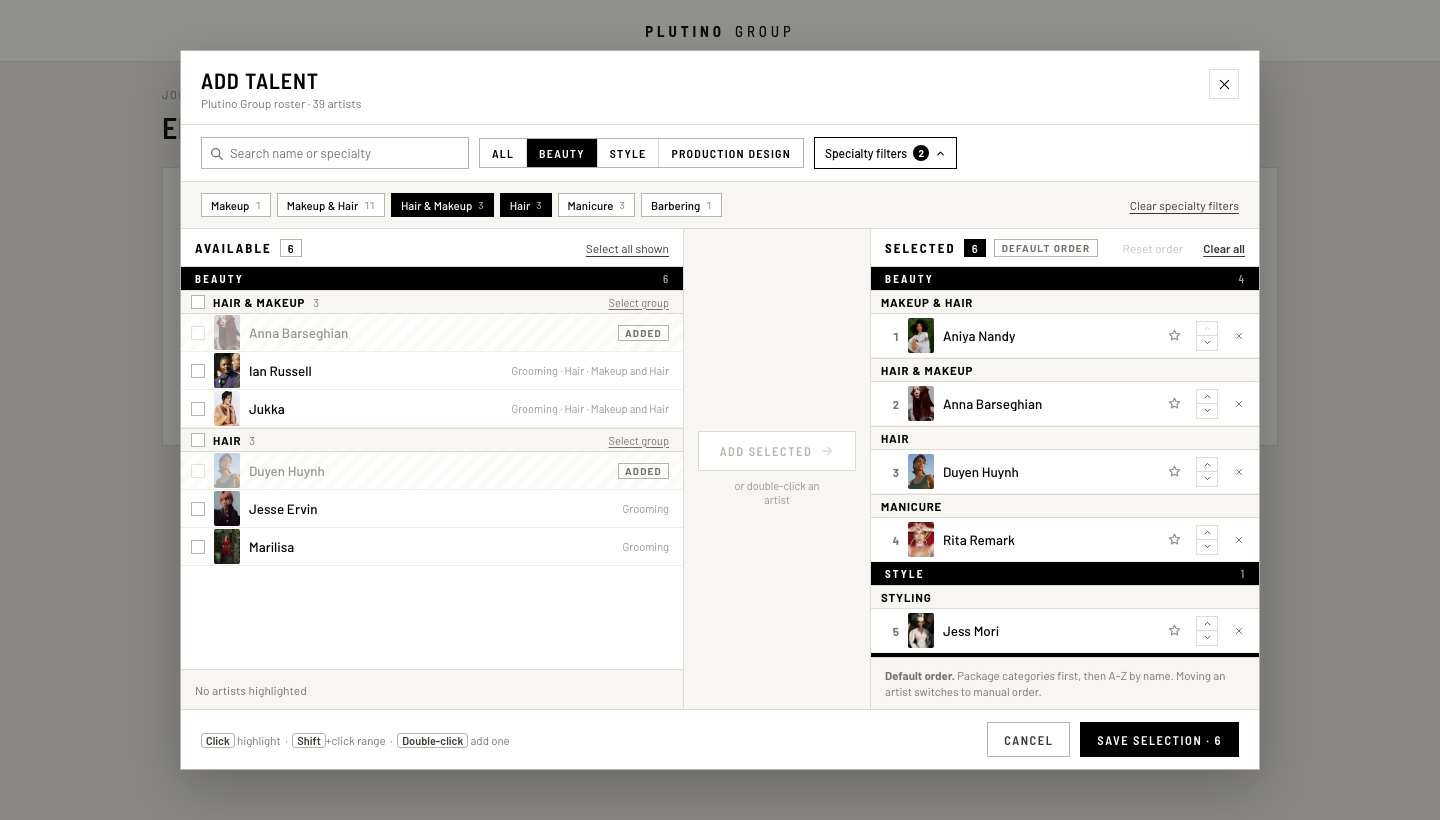
Prototype. Real Plutino roster, taxonomy per the 2026-08-10 ordering spec. Not production code.
State
Viewport
Mobile tab
Desktop — 1440 × 820100% scale, not zoomed
Mobile — 390 × 844100% scale, not zoomed
How to read this
Both frames render at 100% scale — nothing is zoomed or shrunk to fit. Desktop is on top at 1440 × 820, mobile below at 390 × 844. If your window is narrower than 1440, the desktop frame scrolls inside its own box rather than shrinking.
Both frames are the same file (app.html) at two real viewport widths — the mobile frame is not a redraw, it is the same markup under the 640px media query.
Both frames are live. Click rows, shift-click ranges, double-click to add one, use the ▲▼ buttons, star a lead, clear all.
The State buttons reset both frames into the required review states.
The Mobile tab buttons switch the mobile frame between the Available and Selected panes.
Full notes
IMPLEMENTATION-NOTES.md — interaction contract, ordering rules, visual decisions, open questions, and what implementation would need.